The Perfect Landing Page. Landing page examples and 12 tips
by Dave Chaffey
Discussion of web design in companies who don’t know the power of landing pages still often focuses on the home page. But savvy companies know that custom landing pages are essential to maximise conversion of leads when using inbound marketing techniques like SEO, AdWords and social media to drive visitors to a site.
So this prompts the question, which factors make for the most effective landing page? Is a ‘Perfect Landing Page’ possible? This post gives a summary of my top 12 tips and places to look to find more examples.
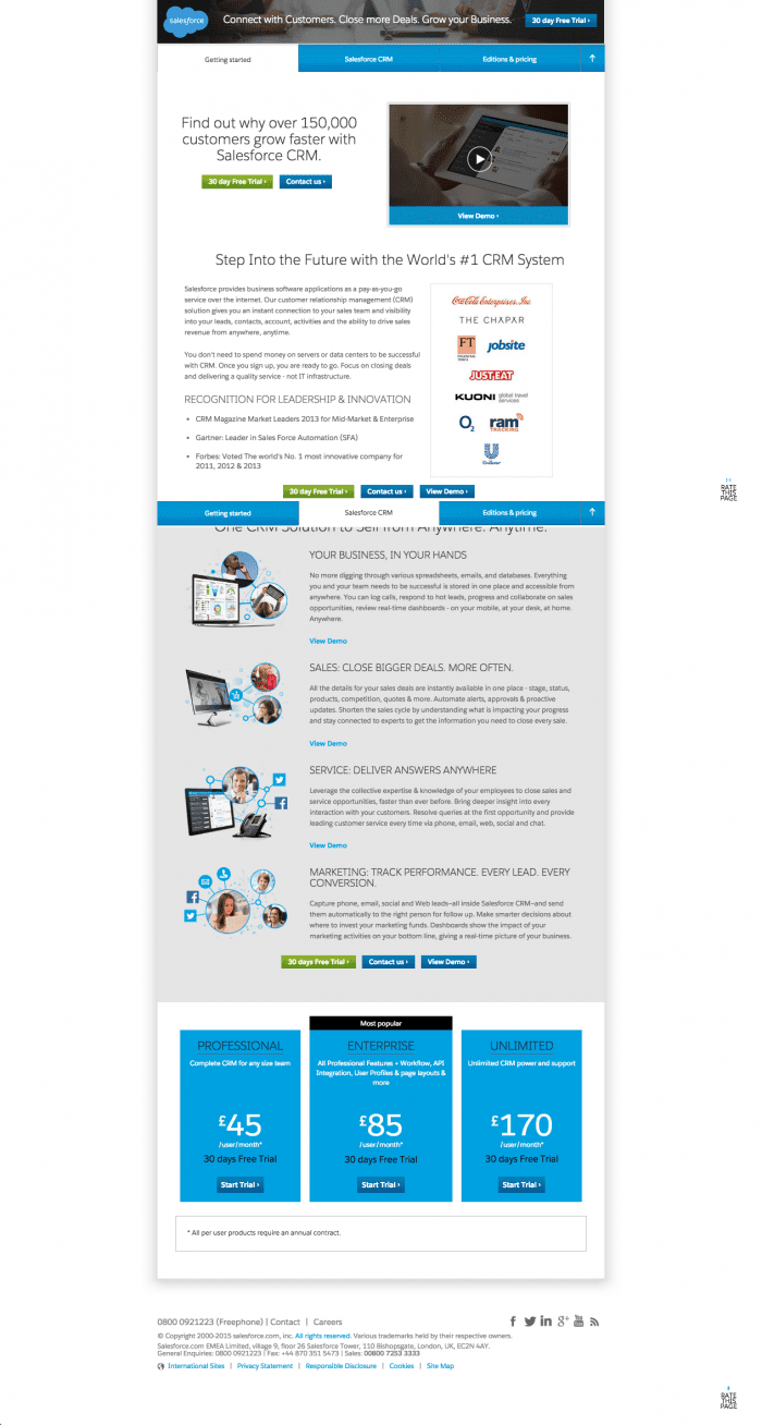
Salesforce.com – an example of the evolution of the Perfect Landing Page?
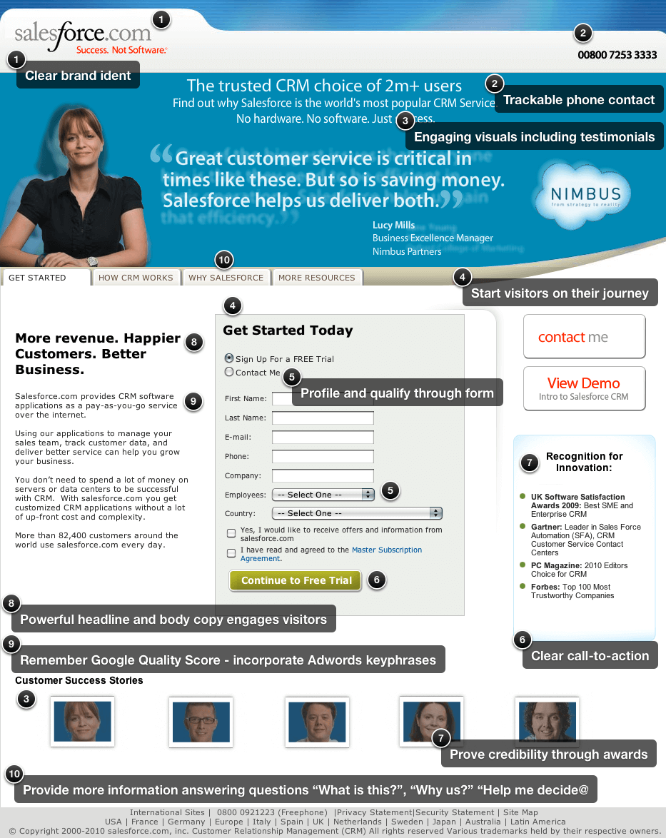
To illustrate these tips, I’m going to use an example I’ve used in training many years – it’s the B2B Salesforce.com lead generation page for its CRM service targeting searchers who are looking for CRM systems.
The Salesforce.com landing pages illustrate many good practices. I’ve marked up what I see as good about this format. It’s maybe not perfect, but much better than most! Let me know what you don’t like about it! Or how things differ for consumer sites! This is the original ‘classic’ landing page example that I used to use in training. It shows many good practices, but has one big problem.
However, there is a problem with this type of landing page, and you can probably spot it! It’s not mobile responsive, so isn’t effective on Smartphone. So today we see a much longer-form landing page…


 It’s always good to know what others are doing in their strategy, but is it the right path for your company? Not necessarily. You need to lead the way in order to attract customers, so don’t be sheep when it comes to your email marketing strategy.